
Shower Control Prototype
Concept
As part of my rapid prototyping class, I explored the advantages creating low to mid-level fidelity 3D models to test the product’s features from potential users.
For this exercise, I was given the scenario of helping the company OXO — known for delivering well-designed, comfortable and easy to use tools for cooking and food preparation — explore other opportunities to expand their business by designing new product lines that incorporate sensors and digital UIs for precision results. More specifically, I had to choose one of three different product lines to design a prototype for: an immersion blender, stud-finder, or shower control interface.
I chose to design a new shower control interface with a “high-end, multi-feature valve and temperature control.” Other requirements included:
-
product controls and interface must fit within the dimensions of approximately 4 x 4 x 2 in volume
-
product weight is approximately 0.75 pounds, and should be able to be mounted on a wall
-
digital display will show settings such as temperature, volume, valves (this could be used to control whether water comes out of the tub spout, the shower head, etc.)
-
physical affordances and controls must be easy to use when visibility and dexterity are challenged by soapy hands, steamy showers, and absence of corrective lenses
I chose to prototype a new shower control interface because I thought the design requirements called for a very conscientious attention to a large variety of possible users.
Design
First Iteration
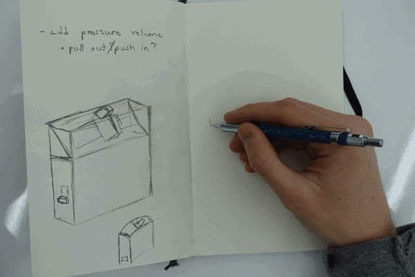
After my first examination of the design requirements, I drew up some sketches of a shower interface that attempted to include all of the requirements into one single interface. By using duct tape, newspaper, and a golf ball, I was able to quickly mock up a prototype that implemented my sketches into a physical model that could be tested and evaluated. I showed the prototype to a colleague of mine, and we discussed the design and functionality of the various components on the model.
What Worked
-
Valve Switch: The switch was in a good location to avoid being accidentally switched to a different mode.
-
Temperature Adjust: The sliding mechanism was intuitive.
-
Digital Interface: Information on the screen was large enough to read.
What Didn't Worked
-
Volume Pressure Knob: Although the interaction was fairly intuitive, the twisting motion of the knob meant that a user would need to easily twist it using their fingers — not a good interaction for certain disabilities.
-
Digital Interface: The location of the screen might be in a good position for someone taking a bath while still being able to use the controls, but the screen would be difficult to view for anybody taking a shower.

Second Iteration
For my second iteration, I designed a completely different interface rather than making adjustments to my first iteration because I realizing the fault in having a twist control knob — causing me to think a lot more about the accessibility of my shower control interface.
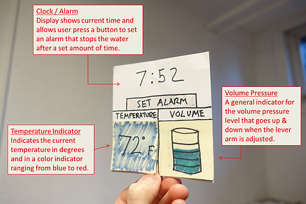
I also determined that it would be best to separate the UI display from the rest of the controls. By placing the display a little higher up from the controls, someone taking a shower could view the display more easily and someone taking a bath could still view the display. I also implemented a timer to stop the water.
As I thought about a more accessible way to adjust water temperature and volume pressure, I went with a

more traditional design to the controls because I determined that a lever arm would hopefully make it easier to nudge forward, backward, and side to side in order to adjust temperature and volume pressure.

Usability Test with Second Iteration
What Worked
-
Volume Pressure Lever and Temp. Adjustment: By telling the user to turn on the water, adjust the pressure, and change the temperature, the user found it fairly intuitive to maneuver the lever arm appropriately. However, I should have placed better indications for which way to turn and tilt the arm in order to achieve such water styles.
-
Valve Digital/Analog Button: Digital indicator showing either shower or tub mode was easy to read, but although it was a push button, the user didn’t know how to distinguish between pushing or touching it.
-
Digital Interface: The placement of the display was mutually pleasant for someone taking a shower or bath. The temperature indicator was simple to understand, and the clock / alarm is a useful addition (though I could have implemented a test for setting the alarm).
What Didn't Work
-
Volume Pressure Indicator: The user didn’t see a purpose in having an indicator for the water pressure since the user would be able to feel the pressure of the water coming out. One way to fix this might be to research more about the flow of water volume per second in showers to possibly place that information on the digital interface.
Reflection
I thought this exercise was enjoyable and stimulating to my growth as a user experience designer. By implementing similar design strategies from paper prototyping, I was able to quickly sketch, model, test, and create further iterations of my prototypes. The process of creating 3D model prototypes was new to me because I used to associate the methods strictly with industrial designers. However, I can now see myself implementing these modeling techniques into my own future designs due to the low-budget requirements and great benefits of physically interacting with my design ideas. Through these exercises, I am finding more and more of the swinging nature of design thinking — if I find myself thinking/sketching too much, I should start creating more (and vice versa).